
1 Some of the icons have blurred fringes at the edges of the square, which happens because another icon is too close in icons.svg and its edge's antialiasing gets into the neighboring icon. Watch out for this.
2 I don't like the thick white "midline" in these icons. What does it represent? Why white? If you want to show the midline axis, just a single solid black stroke, solid or dashed, is enough. The white is too salient and confusing.
3 I also don't like the highlights on the icons. Hey, this is just strokes! They are not supposed to be highlighted or shaded in any way. It's just silly. I have to spend extra milliseconds every time I try to figure out the join shape, dazzled by all the highlights and the white thing in it.
3 The butt cap icon is wrong: the white midline (of whatever this is) must not and can not extend beyond the stroke itself. Never.

bulia byak wrote:
2 I don't like the thick white "midline" in these icons. What does it represent? Why white? If you want to show the midline axis, just a single solid black stroke, solid or dashed, is enough. The white is too salient and confusing.
3 I also don't like the highlights on the icons. Hey, this is just strokes! They are not supposed to be highlighted or shaded in any way. It's just silly. I have to spend extra milliseconds every time I try to figure out the join shape, dazzled by all the highlights and the white thing in it.
3 The butt cap icon is wrong: the white midline (of whatever this is) must not and can not extend beyond the stroke itself. Never.
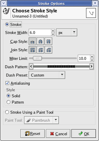
in my understanding, those changes were made in order to have icons similar with The Gimp, see attached a screenshot from Gimp
On Mon, 17 Jan 2005 10:57:49 +0200, Nicu Buculei <nicu@...398...> wrote:
bulia byak wrote: in my understanding, those changes were made in order to have icons similar with The Gimp, see attached a screenshot from Gimp
Thanks, I didn't know that, but this does not change my opinion. All I have said applies to Gimp's icons as well.

On Mon, Jan 17, 2005 at 04:34:04AM -0400, bulia byak wrote:
1 Some of the icons have blurred fringes at the edges of the square, which happens because another icon is too close in icons.svg and its edge's antialiasing gets into the neighboring icon. Watch out for this.
Hm, icons borders were still grey, I've fixed that.
2 I don't like the thick white "midline" in these icons. What does it represent? Why white? If you want to show the midline axis, just a single solid black stroke, solid or dashed, is enough. The white is too salient and confusing.
Changed to black. I'm not sure if it's less dazzling, though. :)
3 I also don't like the highlights on the icons. Hey, this is just strokes! They are not supposed to be highlighted or shaded in any way. It's just silly. I have to spend extra milliseconds every time I try to figure out the join shape, dazzled by all the highlights and the white thing in it.
Reset to grey.
3 The butt cap icon is wrong: the white midline (of whatever this is) must not and can not extend beyond the stroke itself. Never.
Adjusted.

bulia byak wrote:
1 Some of the icons have blurred fringes at the edges of the square, which happens because another icon is too close in icons.svg and its edge's antialiasing gets into the neighboring icon. Watch out for this.
2 I don't like the thick white "midline" in these icons. What does it represent? Why white? If you want to show the midline axis, just a single solid black stroke, solid or dashed, is enough. The white is too salient and confusing.
3 I also don't like the highlights on the icons. Hey, this is just strokes! They are not supposed to be highlighted or shaded in any way. It's just silly. I have to spend extra milliseconds every time I try to figure out the join shape, dazzled by all the highlights and the white thing in it.
3 The butt cap icon is wrong: the white midline (of whatever this is) must not and can not extend beyond the stroke itself. Never.
Hello Bulia! Thanks for the feedback on the icons. Well, as Nicu already have pointed out these are the same icons the Gimp uses for these actions. The xpms needed to go out and this was a quick solution (just about an hour of trace work). They are also nice because if Inkscape and Gimp shared the same looks for icons it would feel more like a suite. This is something Adobe realized years ago, even before the release of the Creative Suite and Illustrator, InDesign and Photoshop all share the same looks for icons and have tools that work in the same way. This means someone working in pre-press (or whatever) and already uses Photoshop and Illustrator much rather use InDesign than Quark Express because it behaves and looks like the other two tools he/she uses 70% of their time at work. That is something that needs to be adressed if they are to be converted to free software tools in the future.
But yes, I agree, the icons have some shortcomings (expecally the use of unneeded gradient). Maybe we can send the modified icons to the gimp developers and suggest they use the improved icons in the future. I'll mail the author of the gimp icons right away and see what he thinks about it. - Andreas

On Mon, 17 Jan 2005 17:18:30 +0100, Andreas Nilsson <nisses.mail@...563...> wrote:
hour of trace work). They are also nice because if Inkscape and Gimp shared the same looks for icons it would feel more like a suite. This is something Adobe realized years ago, even before the release of the Creative Suite and Illustrator, InDesign and Photoshop all share the same looks for icons and have tools that work in the same way. This means someone working in pre-press (or whatever) and already uses Photoshop and Illustrator much rather use InDesign than Quark Express because it behaves and looks like the other two tools he/she uses 70% of their time at work. That is something that needs to be adressed if they are to be converted to free software tools in the future.
I wonder, if Scribus guys are watching this thread :)
Alexandre
participants (5)
-
 Alexandre Prokoudine
 -
 Andreas Nilsson
 -
 bulia byak
 -
 Kees Cook
 -
 Nicu Buculei