
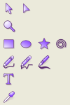
For all those of you who like a more Adobe-ish look for the drawing tool icons: Attached is a icon set that covers the drawing tools. The groups are named correctly, so you only need to delete the icons in the icons.svg and insert the attached file (you might have to ungroup the inserted file afterwards)
Enjoy!
David

For all those of you who like a more Adobe-ish look for the drawing
tool
icons: Attached is a icon set that covers the drawing tools. The groups are named correctly, so you only need to delete the icons in the icons.svg and insert the attached file (you might have to ungroup the inserted file afterwards)
Shape-wise... they are waaay more slick in my opinion. The single color scheme is the least appealing part though.
BTW the Calligraphy pen, and those other drawing tools look a _lot_ nicer. (calligraphy especially... the just fit the tools better)
Perhaps you could color them a bit more like the existing ones though. Just my .02...
-Josh
BTW the Calligraphy pen, and those other drawing tools look a _lot_ nicer. (calligraphy especially... the just fit the tools better)
Perhaps you could color them a bit more like the existing ones though. Just my .02...
sure I can :)
but now my gradients get messed up, when I try to import them into the icons.svg :( Can anybody help me out with this?

I think it all looks very good :)
David Christian Berg wrote:
BTW the Calligraphy pen, and those other drawing tools look a _lot_ nicer. (calligraphy especially... the just fit the tools better)
Perhaps you could color them a bit more like the existing ones though. Just my .02...
sure I can :)
but now my gradients get messed up, when I try to import them into the icons.svg :( Can anybody help me out with this?

On Thu, 06 Jan 2005 22:12:08 +0100, David Christian Berg <david@...407...> wrote:
but now my gradients get messed up, when I try to import them into the icons.svg :( Can anybody help me out with this?
Most likely this is a name clash. You copied gradients from icons.svg and changed them, now they conflict with the original ones when you copy them back. The only workaround so far is to manually rename the gradients and their references in XML editor :(

On Thu, 6 Jan 2005, Joshua A. Andler wrote:
Date: Thu, 6 Jan 2005 13:20:18 -0700 From: Joshua A. Andler <joshua@...533...> To: david@...407... Cc: inkscape-devel@lists.sourceforge.net Subject: RE: [Inkscape-devel] Draw Icons
For all those of you who like a more Adobe-ish look for the drawing
tool
icons: Attached is a icon set that covers the drawing tools. The groups are named correctly, so you only need to delete the icons in the icons.svg and insert the attached file (you might have to ungroup the inserted file afterwards)
Shape-wise... they are waaay more slick in my opinion. The single color scheme is the least appealing part though.
These icons are way more like what I'm used to from Windows programs, which I dont mind but not for everyone. I like the icons themselves but not the colouring and I will attempt to explain why.
The thing about the colour scheme is that Adobe fully colours the icon of the active tool (on mouseover and if it is selected) and leaves the other icons in monochrome -- sort of like an equivalent to being greyed out -- so that the current tool is more distinct.
I dont think this notion of only colouring the active button actually works very well. It makes it harder to identify and select a different tool and I dont think there is any need to further distinguish the currently selected tool. I also dont think it is very aesthetically pleasing.
I suppose it might be interesting if you could have a theme that allowed such a combination of monochrome and full colour icons as described but it feels somehow incomplete to have the Adobe style monochrome icons without the corresponding full colour icons for the active item. But enough nitpicking from me, it is very interesting and very encouraging that people are already creating different icon themes for Inkscape.
Sincerely
Alan Horkan
Free SVG Clip Art http://OpenClipArt.org Abiword is Awesome http://abisource.com
Hey Alan,
seems like you missed out on the second set of icons, I sent do the list :) Anyways, I know you're right about the coloring in Adobe... I'd prefer it to be just like that. Monochrome, or close to monochrome as normal and colored as prelight state. But well, that won't work out. It definitely is _not_ Gnome-style, but hey, I like XP style quite a bit (see my eXperience gtk theme) and that's why the icons look the way they do... Gnomish is so "triste", grayish, dull :)
I already created some icons for flip and the such, a while ago and will adjust them to go with the new icons.
Take care!
David

David Christian Berg wrote:
Hey Alan,
seems like you missed out on the second set of icons, I sent do the list :) Anyways, I know you're right about the coloring in Adobe... I'd prefer it to be just like that. Monochrome, or close to monochrome as normal and colored as prelight state. But well, that won't work out. It definitely is _not_ Gnome-style, but hey, I like XP style quite a bit (see my eXperience gtk theme) and that's why the icons look the way they do... Gnomish is so "triste", grayish, dull :)
I already created some icons for flip and the such, a while ago and will adjust them to go with the new icons.
Take care!
David
Hello David! In some other mail on this list I complained that you did not use the hig-look for the icons, but now when I read that these are made to match the xp-style I understand why you have choosed this look. Sorry for that, I had been away for a couple of days and had a lot of mails to go through. I think it would be really cool if this look could be switched on as default for the windows builds. I have started to draw some stuff that is made to fit in better with the gnome desktop. Is anyone working on a osx-theme? - Andreas Nilsson

On Thu, 06 Jan 2005 21:10:22 +0100, David Christian Berg <david@...407...> wrote:
For all those of you who like a more Adobe-ish look for the drawing tool icons: Attached is a icon set that covers the drawing tools. The groups are named correctly, so you only need to delete the icons in the icons.svg and insert the attached file (you might have to ungroup the inserted file afterwards)
Wow! Now I can even see what instrument is Pen in Inkscape :))
Great Job! It's just lila color I don't like very much. All the rest -- way to go :(
Alexandre
participants (7)
-
 Alan Horkan
 -
 Alexandre Prokoudine
 -
 Andreas Nilsson
 -
 bulia byak
 -
 David Christian Berg
 -
 Jonathan Leighton
 -
 Joshua A. Andler