On May 16, 2006, at 10:23 AM, Jakub Steiner wrote:
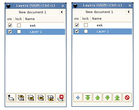
I suggest simplifying those icons to the core of what they are trying to
say. Use distinguishable silhouettes, color. An image is worth more than
my poor writing:
Āhttp://jimmac.musichall.cz/stuff/visual-noise.png
That does make things look much prettier...
... however, do you have an idea how that can tie into the logical work being done with Tango and the ArtLibre stuff?
The latter does have some names for layer raise, lower, etc.
Basically, would you suggest to use the base "go-*" names/icons in the dialog, and the layer ones elsewhere (e.g. menus and toolbars)?