Spin slider widget: Opinions needed!

Hi,
I've been looking into replacing the Gimp Spin Slider widget (e.g Blur/Opacity in the Fill and Stroke dialog). The widget is licensed under GPLv3 and is the only reason Inkscape as a whole is licensed under GPLv3 rather GPLv2.. The board sometime ago agree that being a GPLv2 program was desirable (I don't remember the exact reasoning).
A normal Gtk Spin Slider (aka Gtk::SpinButton) has an option to show the "progress" of slider, that is the percentage (defined in some arbitrary way) between a minimum and maximum value. This in Gtk 2 is shown as a solid blue bar with width proportional to the value that covers the widget from top to bottom. In Gtk 3 the solid blue bar is replaced by a thin blue bar at the bottom of the widget.
As far as I can tell, the Gimp version of the slider makes three changes:
1. It allows for a label inside the widget. This is a nice space saving feature. The widget handles changing the label text from black to white as the progress bar moves across the label.
2. It allows for a non-uniform scale by adding a "gamma" factor.
3. It adds the ability to drag the progress bar to change the value. If one drags from the top (down arrow cursor) the change follows the cursor directly. If one drags along the bottom half (double headed cursor) the change is finer and relative to the current value.
I've always found that dragging the progress bar to be a bit awkward. One problem is that one can not start the drag at the far right of the widget as that area is reserved for typing a value directly in. Also, the different functionality of starting the drag in the top of the widget vs. the bottom of the widget is confusing.
Since I am rewriting this widget, I can adjust it to what people want:
* Do you want the progress bar?
* If so, should it be the full height of the widget (quite a bit more complicated)?
* Do you want to be able to drag the bar? With one/two methods?
* Any other changes?
Thanks,
Tav

As I understand it, one reason for the design of the Gimp spinbox is to make it easier to use with a graphics tablet stylus - hence the dragging of the bar. Personally I find it awkward to use whether with a mouse or a stylus, and particularly dislike the problems with dragging from the right that you mentioned. As for accidentally setting blur to 100% when trying to focus the text at the right... that's the bane of my Inkscape life! I would love to see them replaced with something else.
* Do you want the progress bar?
I do like the presence of the progress bar. It provides immediate feedback that plain numbers don't. If the box says 9, is that 9 out of 10 or 9 out of 100? A progress bar immediately gives you a sense of scale.
- If so, should it be the full height of the widget (quite a bit more
complicated)?
I don't necessarily think it should be full height, but it should be clear and obvious. It should also be clear that it's a progress bar, not an underline or other decoration - so perhaps also ensure the "unfilled" portion of the bar is visible.
* Do you want to be able to drag the bar? With one/two methods?
Dragging the bar is a nice feature which makes the widget a lot more immediate to use - great for just playing around.
I don't like the current two-method implementation, as I often end up activating the wrong one. That said, there are definite advantages to allowing both coarse and fine control. Perhaps some other approach could be used to still provide that capability - here are some possibilities off the top of my head:
* Make the amount of change proportional to the speed of the pointer movement, so that fast drags make coarse changes, whilst slow drags provide fine adjustment.
* Once the mouse button is held down, use left/right movements for coarse and up/down movements for fine adjustments.
* Left mouse button for coarse changes, right for fine. (Perhaps not so great for tablet users)
- Any other changes?
* One great feature in many Inkscape spinboxes is the context menu to let you select from a list of pre-defined values. The Gimp spinboxes lack these. Ideally I'm sure you would want a means for the developer to provide specific values (with comments), but having a standard fallback that lists, say, 10 evenly spaced values would be useful.
* The ability to do basic maths in Inkscape spinboxes is another useful feature that the Gimp ones lack.
* Mousewheel support almost goes without saying. But I'm saying it anyway, just in case ;)
* When dragging with the left button, clicking the right one should cancel the change and revert back to the previous value.
Regards,
Mark
On Mon, 2017-12-04 at 13:27 +0000, Mark Crutch wrote:
As I understand it, one reason for the design of the Gimp spinbox is to make it easier to use with a graphics tablet stylus - hence the dragging of the bar. Personally I find it awkward to use whether with a mouse or a stylus, and particularly dislike the problems with dragging from the right that you mentioned. As for accidentally setting blur to 100% when trying to focus the text at the right... that's the bane of my Inkscape life! I would love to see them replaced with something else.
My toy implementation removed the overlap... much easier to use.
- Do you want the progress bar?
I do like the presence of the progress bar. It provides immediate feedback that plain numbers don't. If the box says 9, is that 9 out of 10 or 9 out of 100? A progress bar immediately gives you a sense of scale.
- If so, should it be the full height of the widget (quite a bit
more
complicated)?
I don't necessarily think it should be full height, but it should be clear and obvious. It should also be clear that it's a progress bar, not an underline or other decoration - so perhaps also ensure the "unfilled" portion of the bar is visible.
- Do you want to be able to drag the bar? With one/two methods?
Dragging the bar is a nice feature which makes the widget a lot more immediate to use - great for just playing around.
I don't like the current two-method implementation, as I often end up activating the wrong one. That said, there are definite advantages to allowing both coarse and fine control. Perhaps some other approach could be used to still provide that capability - here are some possibilities off the top of my head:
- Make the amount of change proportional to the speed of the pointer
movement, so that fast drags make coarse changes, whilst slow drags provide fine adjustment.
- Once the mouse button is held down, use left/right movements for
coarse and up/down movements for fine adjustments.
Sounds reasonable. I'll try to implement.
- Left mouse button for coarse changes, right for fine. (Perhaps not
so great for tablet users)
- Any other changes?
- One great feature in many Inkscape spinboxes is the context menu to
let you select from a list of pre-defined values. The Gimp spinboxes lack these. Ideally I'm sure you would want a means for the developer to provide specific values (with comments), but having a standard fallback that lists, say, 10 evenly spaced values would be useful.
- The ability to do basic maths in Inkscape spinboxes is another
useful feature that the Gimp ones lack.
- Mousewheel support almost goes without saying. But I'm saying it
anyway, just in case ;)
- When dragging with the left button, clicking the right one should
cancel the change and revert back to the previous value.
Regards,
Mark
Check out the vibrant tech community on one of the world's most engaging tech sites, Slashdot.org! http://sdm.link/slashdot__________ _____________________________________ Inkscape-user mailing list Inkscape-user@lists.sourceforge.net https://lists.sourceforge.net/lists/listinfo/inkscape-userD

Hi Tav,
oh, I never noticed the two different modes... lol. I've always found it annoying that it is so hard to set values in 0.1 steps, which I needed frequently (my blurred objects are usually small, such as shadows behind a text) - while it has already been possible.
I've always thought I had to use the numeric entry field for that fine-tuning (and found that field pretty annoying, when I accidentally clicked too much to the left and got 100% blur, taking long to render and freezing Inkscape for some time before I can continue to work). Having that field outside the slider would be useful.
Perhaps if scrolling with mouse-wheel meant 'fine-tune', dragging meant 'quick change' and clicking meant 'here', that could be good?
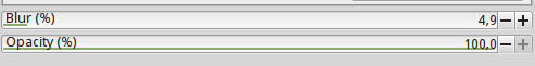
Currently, that thin strip of a bar is indeed difficult to see. It doesn't necessarily need to fill the whole height, but a little more height would make it easier on the eyes - the bars are really tiny already. (Screenshot attached for those who don't have a copy of the current development version installed)
Can you post a screenshot or gif of the default widget with /without progress bar?
Maren
P.S.: and can someone fix the filter area in master before anyone thinks of releasing 0.93? It's much too small and cuts off parts of the object, making blur kind of useless to non-experienced users, when they would always need to fix the area in the filter editor...
Am 04.12.2017 um 13:53 schrieb Tavmjong Bah:
Hi,
I've been looking into replacing the Gimp Spin Slider widget (e.g Blur/Opacity in the Fill and Stroke dialog). The widget is licensed under GPLv3 and is the only reason Inkscape as a whole is licensed under GPLv3 rather GPLv2.. The board sometime ago agree that being a GPLv2 program was desirable (I don't remember the exact reasoning).
A normal Gtk Spin Slider (aka Gtk::SpinButton) has an option to show the "progress" of slider, that is the percentage (defined in some arbitrary way) between a minimum and maximum value. This in Gtk 2 is shown as a solid blue bar with width proportional to the value that covers the widget from top to bottom. In Gtk 3 the solid blue bar is replaced by a thin blue bar at the bottom of the widget.
As far as I can tell, the Gimp version of the slider makes three changes:
- It allows for a label inside the widget. This is a nice space saving
feature. The widget handles changing the label text from black to white as the progress bar moves across the label.
It allows for a non-uniform scale by adding a "gamma" factor.
It adds the ability to drag the progress bar to change the value. If
one drags from the top (down arrow cursor) the change follows the cursor directly. If one drags along the bottom half (double headed cursor) the change is finer and relative to the current value.
I've always found that dragging the progress bar to be a bit awkward. One problem is that one can not start the drag at the far right of the widget as that area is reserved for typing a value directly in. Also, the different functionality of starting the drag in the top of the widget vs. the bottom of the widget is confusing.
Since I am rewriting this widget, I can adjust it to what people want:
Do you want the progress bar?
If so, should it be the full height of the widget (quite a bit more
complicated)?
Do you want to be able to drag the bar? With one/two methods?
Any other changes?
Thanks,
Tav
Check out the vibrant tech community on one of the world's most engaging tech sites, Slashdot.org! http://sdm.link/slashdot _______________________________________________ Inkscape-user mailing list Inkscape-user@lists.sourceforge.net https://lists.sourceforge.net/lists/listinfo/inkscape-user

Am 04.12.2017 um 15:07 schrieb Maren Hachmann:
(Screenshot attached for those who don't have a copy of the current development version installed)
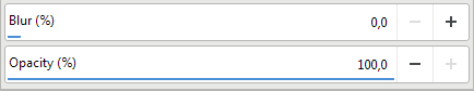
Interesting, looks completely different than what I have (which is - I guess - stock Adwaita), see attachement.
Looks quite clear - but also uses about twice the space :-/
Regards, Eduard
Just tested on vanilla Ubuntu 16.04. The plus/minus buttons are barely big enough to hit them with a mouse - but the bars are actually filled in completely...
https://inkscape.org/en/~Moini/%E2%98%85sliders
Maren
Am 04.12.2017 um 15:36 schrieb Eduard Braun:
Am 04.12.2017 um 15:07 schrieb Maren Hachmann:
(Screenshot attached for those who don't have a copy of the current development version installed)
Interesting, looks completely different than what I have (which is - I guess - stock Adwaita), see attachement.
Looks quite clear - but also uses about twice the space :-/
Regards, Eduard
On Mon, 2017-12-04 at 22:54 +0100, Maren Hachmann wrote:
Just tested on vanilla Ubuntu 16.04. The plus/minus buttons are barely big enough to hit them with a mouse - but the bars are actually filled in completely...
Maybe it's theme dependent. What's the theme Ubuntu uses?
Maren
Am 04.12.2017 um 15:36 schrieb Eduard Braun:
Am 04.12.2017 um 15:07 schrieb Maren Hachmann:
(Screenshot attached for those who don't have a copy of the current development version installed)
Interesting, looks completely different than what I have (which is
- I
guess - stock Adwaita), see attachement.
Looks quite clear - but also uses about twice the space :-/
Regards, Eduard
Check out the vibrant tech community on one of the world's most engaging tech sites, Slashdot.org! http://sdm.link/slashdot _______________________________________________ Inkscape-user mailing list Inkscape-user@lists.sourceforge.net https://lists.sourceforge.net/lists/listinfo/inkscape-user
On Tue, 2017-12-05 at 07:50 +0100, Tavmjong Bah wrote:
On Mon, 2017-12-04 at 22:54 +0100, Maren Hachmann wrote:
Just tested on vanilla Ubuntu 16.04. The plus/minus buttons are barely big enough to hit them with a mouse - but the bars are actually filled in completely...
Maybe it's theme dependent. What's the theme Ubuntu uses?
OK, it is definitely theme dependent. The progress bar actually does cover the entire height of the widget (with a small margin). The Adwaita theme makes the background transparent but sets the bottom border width to 2px so what we are seeing is just the bottom border.
CSS:
progress { background: rgb(74,144,217); }
Tav

On 04.12.2017 13:53, Tavmjong Bah wrote:
- It allows for a label inside the widget. This is a nice space saving
feature. The widget handles changing the label text from black to white as the progress bar moves across the label.
This is very valuable, as the width of the slider is critical for efficient use and an external label would be "dead" space.
I played with such designs in mockups a few times. Example attached. It's part of a series where the colors where meant to signify minimum, negative range, exact zero, positive range or maximum. Note that I reduced the gap between labels and values to ease scanning. This at the cost that activating numerical editing may require a double or modifier-click.
- It adds the ability to drag the progress bar to change the value. If
one drags from the top (down arrow cursor) the change follows the cursor directly. If one drags along the bottom half (double headed cursor) the change is finer and relative to the current value.
Please don't call it a progress bar; it's a slider and the part of it that signifies the value could be called value bar or maybe indicator
There are a few cases to handle: - fast and course adjustments - fine and slow - small steps - precise input (numerical entry)
Because of this, I think it is a worthwhile idea to handle both fast-and-coarse and fine-and-slow adjusting in a discoverable manner, no modifiers used.
After all, I spend quite some time trying to come up with a good way to do just that. See https://thorwil.wordpress.com/2007/05/01/fan-sliders/ (which I am not saying is a solution, here).
One inspiration was the astonishingly complex ladder widget in Houdini: http://www.sidefx.com/docs/houdini/basics/ladder Of course that thing exists because value ranges can be huge and fine-grained in their consequences in that application.
Having 2 ways of adjusting available without modifier is nice, but it seems the GIMP widget is often misunderstood. Upper edge is used for setting the value to where the pointer is. A jump; only then do you have a 1:1 relation between movement and value change.
Both halves suffer from the delays when the value bar is not updated until the effect of the change has been rendered. I understand why it's done that way, but have to note that it makes hitting a desired value-range harder. I might prefer some pulsing/blinking or indicating both previous value and soon-to-be value, instead.
I've always found that dragging the progress bar to be a bit awkward. One problem is that one can not start the drag at the far right of the widget as that area is reserved for typing a value directly in.
That's a non-issue for the lower half, as it doesn't matter from where you start a slide and you have plenty of area to just do that. For the upper area, the user has to figure out that they have to click to the left of the numbers and do a drag, in order to reach that part of the range. That is rather bad.
Ways to deal with the slider vs numerical input issue: - trigger input only on the lower half, allow click-jump on the entire upper half. - Put the label unto the slider, but keep the numbers outside. - Use a narrow button to the right of the main widget, as sole mean to go into numerical input. - Interpret numbers and arrow keys as input as soon as the pointer hovers the widget (incompatible with pen and touch). - Activate numerical input only on double-click or some modifier-click. - Use the upper half for 1:1 adjustment, but without jump-to-pointer. Offer an alternative jump action, e.g. on middle-click.
Since I am rewriting this widget, I can adjust it to what people want:
- Do you want the progress bar?
Yes.
- If so, should it be the full height of the widget (quite a bit more
complicated)?
Maybe.
- Do you want to be able to drag the bar? With one/two methods?
Yes. Aside of 1:1 drag, a fine adjustment could be on Ctrl-drag and jump-to-pointer on middle-click.
participants (5)
-
 Eduard Braun
 -
 Maren Hachmann
 -
 Mark Crutch
 -
 Tavmjong Bah
 -
 Thorsten Wilms