
Hi all,
Following some suggestions and comments (specially bulia byak ones) about the icon set I've made, I try to improved them.
Smaller file (about 500Kb - used and abused of clones and simpler drawings - less nodes and gradients)
New icons for drawing tools - Pencil for freehand - Technical pen for bezier - Inkpen do calligraphic (already there in the first version)
some minor refinements - shadows (ex: text tool) - new plus sign for XML icons - change the eye (layers) but keaped it bright open. - etc.
Use of more neutral colors - ligth Blue (When I try the orange icons on my CRT monitor I realize that they were too bright - I originally made the icons on my laptop LCD) - Made the shapes one colour each, and no colour for the spiral.
- Other things I can't remember any more!!!
You may find it at my uggly site:
http://placide.home.sapo.pt/inkscape/index.html
note: "sapo" means frog in portuguese ;-)
Well that is about it.
Enjoy.

I enjoy it (adorei).
It is gpl too ?
Sincerely Ezequias
Andre Sousa wrote:
Hi all,
Following some suggestions and comments (specially bulia byak ones) about the icon set I've made, I try to improved them.
Smaller file (about 500Kb - used and abused of clones and simpler drawings - less nodes and gradients)
New icons for drawing tools
- Pencil for freehand
- Technical pen for bezier
- Inkpen do calligraphic (already there in the first version)
some minor refinements
- shadows (ex: text tool)
- new plus sign for XML icons
- change the eye (layers) but keaped it bright open.
- etc.
Use of more neutral colors
- ligth Blue (When I try the orange icons on my CRT monitor I realize
that they were too bright - I originally made the icons on my laptop LCD)
Made the shapes one colour each, and no colour for the spiral.
Other things I can't remember any more!!!
You may find it at my uggly site:
http://placide.home.sapo.pt/inkscape/index.html
note: "sapo" means frog in portuguese ;-)
Well that is about it.
Enjoy.
This SF.net email is sponsored by: Splunk Inc. Do you grep through log files for problems? Stop! Download the new AJAX search engine that makes searching your log files as easy as surfing the web. DOWNLOAD SPLUNK! http://ads.osdn.com/?ad_id=7637&alloc_id=16865&op=click _______________________________________________ Inkscape-user mailing list Inkscape-user@lists.sourceforge.net https://lists.sourceforge.net/lists/listinfo/inkscape-user
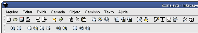
Some icons where not loaded.
You can see on my attached image.
sincerely Ezequias
Ezequias Rodrigues da Rocha wrote:
I enjoy it (adorei).
It is gpl too ?
Sincerely Ezequias
Andre Sousa wrote:
Hi all,
Following some suggestions and comments (specially bulia byak ones) about the icon set I've made, I try to improved them.
Smaller file (about 500Kb - used and abused of clones and simpler drawings - less nodes and gradients)
New icons for drawing tools - Pencil for freehand
- Technical pen for bezier
- Inkpen do calligraphic (already there in the first version)
some minor refinements
- shadows (ex: text tool)
- new plus sign for XML icons
- change the eye (layers) but keaped it bright open.
- etc.
Use of more neutral colors
- ligth Blue (When I try the orange icons on my CRT monitor I realize
that they were too bright - I originally made the icons on my laptop LCD)
Made the shapes one colour each, and no colour for the spiral.
Other things I can't remember any more!!!
You may find it at my uggly site:
http://placide.home.sapo.pt/inkscape/index.html
note: "sapo" means frog in portuguese ;-) Well that is about it.
Enjoy.
This SF.net email is sponsored by: Splunk Inc. Do you grep through log files for problems? Stop! Download the new AJAX search engine that makes searching your log files as easy as surfing the web. DOWNLOAD SPLUNK! http://ads.osdn.com/?ad_id=7637&alloc_id=16865&op=click _______________________________________________ Inkscape-user mailing list Inkscape-user@lists.sourceforge.net https://lists.sourceforge.net/lists/listinfo/inkscape-user
Yes. totaly free! gpl (as free as possible)
Qua, 2006-01-04 at 10:21 -0300, Ezequias Rodrigues da Rocha wrote:
I enjoy it (adorei).
It is gpl too ?
Sincerely Ezequias
Andre Sousa wrote:
Hi all,
Following some suggestions and comments (specially bulia byak ones) about the icon set I've made, I try to improved them.
Smaller file (about 500Kb - used and abused of clones and simpler drawings - less nodes and gradients)
New icons for drawing tools
- Pencil for freehand
- Technical pen for bezier
- Inkpen do calligraphic (already there in the first version)
some minor refinements
- shadows (ex: text tool)
- new plus sign for XML icons
- change the eye (layers) but keaped it bright open.
- etc.
Use of more neutral colors
- ligth Blue (When I try the orange icons on my CRT monitor I realize
that they were too bright - I originally made the icons on my laptop LCD)
Made the shapes one colour each, and no colour for the spiral.
Other things I can't remember any more!!!
You may find it at my uggly site:
http://placide.home.sapo.pt/inkscape/index.html
note: "sapo" means frog in portuguese ;-)
Well that is about it.
Enjoy.
This SF.net email is sponsored by: Splunk Inc. Do you grep through log files for problems? Stop! Download the new AJAX search engine that makes searching your log files as easy as surfing the web. DOWNLOAD SPLUNK! http://ads.osdn.com/?ad_id=7637&alloc_id=16865&op=click _______________________________________________ Inkscape-user mailing list Inkscape-user@lists.sourceforge.net https://lists.sourceforge.net/lists/listinfo/inkscape-user

Andre Sousa wrote:
Hi all,
Following some suggestions and comments (specially bulia byak ones) about the icon set I've made, I try to improved them.
Hi Andre,
I don't believe I commented last time you posted these, but I did think they were good. Now I think they're great! The changes you made to the tools (with more color and the changes w/ freehand and bezier) makes a significant difference. All I can say is that these are very professional looking and are just what Inkscape was in need of.
Now for a couple of my thoughts... In the fill and stroke dialog, the radial gradient icon is difficult to make out. In my opinion, the old radial and linear gradient icons were easier to figure out what they did for new users, mostly due to how much contrast they had. And it may just be me, but I find the border on the top and right of the fill and stroke set of icons to be unnecessary and distracting (especially if the icons had more contrast).
Additionally, we're currently lacking icons for a few things, that maybe if we're lucky, you may want to try and tackle. ;-) Specifically the few items in the Text and Edit menus that you don't see icons for. I'd imagine that the text related icons might be a little easier (text to path for example seems straightforward to me). The ones in the Edit menu however pose more of a challenge in my mind. For the most part I'm only suggesting you looking into those icons because you've done such a fabulous job so far. Plus, you'd obviously do the best job of stylistically matching the rest of your icons. Even if you don't try to touch these, you've already done a phenomenal job and we're greatly appreciative.
-Josh

On 1/4/06, Andre Sousa <placide@...607...> wrote:
Hi all,
Following some suggestions and comments (specially bulia byak ones) about the icon set I've made, I try to improved them.
Thanks! Much better this time.
Can we please return the traditional colors for shape icons (rect blue, ellipse red, star yellow)?
Some icons missing: clonetiler_per_row clonetiler_per_column remove_overlaps
The Skew icons in Transform do not really show skewing
Please fix these small issues and I think we can make your set the default.
-- bulia byak Inkscape. Draw Freely. http://www.inkscape.org
bulia byak wrote:
On 1/4/06, Andre Sousa <placide@...607...> wrote:
Hi all,
Following some suggestions and comments (specially bulia byak ones) about the icon set I've made, I try to improved them.
The Skew icons in Transform do not really show skewing
He actually fixed this shortly after he posted that last version. :-)
Some improvments
Can we please return the traditional colors for shape icons (rect blue, ellipse red, star yellow)?
Done.
Some icons missing: clonetiler_per_row clonetiler_per_column
Done. Well... I put in the file some new icons (24x24) that try to indicate the behavior of each tab of the window "clone tiler". I think the 24x24 size could be acceptable because it wouldn't make the window bigger.
remove_overlaps
couldn't find this icon in the original file ?!? please help!
I added three icons, two for: - text on path - remove text from path
and one for - swatches
Please have a look
http://placide.home.sapo.pt/inkscape.html
I have made some minor improvements to some other icons.
Placido André
Andre Sousa wrote:
Some improvments
Can we please return the traditional colors for shape icons (rect blue, ellipse red, star yellow)?
Done.
Saw the preview... nice
Some icons missing: clonetiler_per_row clonetiler_per_column
Done. Well... I put in the file some new icons (24x24) that try to indicate the behavior of each tab of the window "clone tiler". I think the 24x24 size could be acceptable because it wouldn't make the window bigger.
remove_overlaps
couldn't find this icon in the original file ?!? please help!
The up-to-date icons file is at http://svn.sourceforge.net/viewcvs/*checkout*/inkscape/inkscape/trunk/share/...
I added three icons, two for:
- text on path
- remove text from path
and one for
- swatches
Please have a look
Unfortunately, both the zip and tar.gz are giving me a 404
Great work! Thanks again!
-Josh
Joshua A. Andler wrote:
Andre Sousa wrote:
Unfortunately, both the zip and tar.gz are giving me a 404
Great work! Thanks again!
After that popped up in my reader I realized it may have come across as sarcastic because I went straight from one thing to the other. Not intentional at all. They were intended to be separate thoughts. ;-) Sorry.
-Josh
On 1/18/06, Andre Sousa <placide@...607...> wrote:
remove_overlaps
couldn't find this icon in the original file ?!? please help!
It was added after 0.43. Grab the latest file here:
http://svn.sourceforge.net/viewcvs/*checkout*/inkscape/inkscape/trunk/share/...
One more thing: I don't see why the fill type buttons have those black borders on top and right. Can you remove them? Or make them around all 4 sides?
-- bulia byak Inkscape. Draw Freely. http://www.inkscape.org
One more thing: I don't see why the fill type buttons have those black borders on top and right. Can you remove them? Or make them around all 4 sides?
Justn did it. I put the border all around. I think it is easier to read?!? If you prefer without them just tell me and I will remove the borders.

Hi,
The links to the tgz and zip files don't appear to work.
remove_overlaps was recently added. You may need to check out cvs or svn. Two other icons that are missing are use_pressure and use_tilt (needed for the Calligraphy tool).
I was playing around with the edit_clone and edit_unlink_clone icons. I think the metaphor of the lock isn't so good. I tried two linked ovals (as in a chain) for the first and two broken ovals for the latter. You might think about that.
Your icons are nice work. The details are better than the old set although I think I like the stronger colors and bolder nature of the old set better. For example, it is not as easy to distinguish between the linear and radial gradient icons with your icons.
Tav
On Wed, 2006-01-18 at 22:02 +0000, Andre Sousa wrote:
Some improvments
Can we please return the traditional colors for shape icons (rect blue, ellipse red, star yellow)?
Done.
Some icons missing: clonetiler_per_row clonetiler_per_column
Done. Well... I put in the file some new icons (24x24) that try to indicate the behavior of each tab of the window "clone tiler". I think the 24x24 size could be acceptable because it wouldn't make the window bigger.
remove_overlaps
couldn't find this icon in the original file ?!? please help!
I added three icons, two for:
- text on path
- remove text from path
and one for
- swatches
Please have a look
http://placide.home.sapo.pt/inkscape.html
I have made some minor improvements to some other icons.
Placido André
This SF.net email is sponsored by: Splunk Inc. Do you grep through log files for problems? Stop! Download the new AJAX search engine that makes searching your log files as easy as surfing the web. DOWNLOAD SPLUNK! http://sel.as-us.falkag.net/sel?cmd=lnk&kid=103432&bid=230486&da... _______________________________________________ Inkscape-user mailing list Inkscape-user@lists.sourceforge.net https://lists.sourceforge.net/lists/listinfo/inkscape-user
Hi Andre,
I've taken a look at the icons and have found a few "problems". "Problems" is in quotes because I am sure that they aren't true problems from Inkscape's perspective but they are for the easy extraction of the icons to individual files (which I'll need to add them to my book when they become the default).
The following icons have objects that are not included in the icon's group:
    object_align
    inset_path
    dynamic_offset
    linked_offset
    draw_text
The easiest way (I think) of fixing this is to make a new group with the icon and the missing parts, ungroup the old icon group, and then rename the new group with the icon name.
Note that group g13443 is empty
Also, of probably little real significance, is that many of the objects are almost but not quite aligned with the grid. If you keep the XML editor window open you can see when you are just a fraction off.
Tav
Tavmjong,
Also, of probably little real significance, is that many of theobjects are almost but not quite aligned with the grid. If you keep the XML editor window open you can see when you are just a fraction off.
I'm not sure how XML editor can help with this. The Selector tool's XYWH controls are much more helpful.
-- bulia byak Inkscape. Draw Freely. http://www.inkscape.org
On Sun, 2006-01-08 at 19:20 -0400, bulia byak wrote:
Tavmjong,
Also, of probably little real significance, is that many of theobjects are almost but not quite aligned with the grid. If you keep the XML editor window open you can see when you are just a fraction off.
I'm not sure how XML editor can help with this. The Selector tool's XYWH controls are much more helpful.
True that the Selector tool's controls are perhaps more useful in that they take care of all the various transformations for reference objects. But they don't show you when you have crazy transformation matrices... ones with values that differ by a fraction of a percent from an integer or 10e-17 from zero.
On Sun, 2006-01-08 at 19:22 -0400, bulia byak wrote:
The following icons have objects that are not included inthe icon's
group:
    object_align
    inset_path
    dynamic_offset
    linked_offset
    draw_text
The easiest way (I think) of fixing this is to make a new group with
the
icon and the missing parts, ungroup the old icon group, and then
rename
the new group with the icon name.
Much easier is cut the loose objects (Ctrl+X), enter the group (double click), and paste into place (Ctrl+Alt+V).
Yes, I should have thought of this.... I just got to use to using the XML editor to move things around.
Tav
Hi all,
Oops! I'll try to correct these things as soon as possible. And make the missing icons and "correct" shape colors.
Plácido.
PS: Really nice Guide Tav, very helpfull! thanks.
On Seg, 2006-01-09 at 16:28 +0100, Tavmjong Bah wrote:
On Sun, 2006-01-08 at 19:20 -0400, bulia byak wrote:
Tavmjong,
Also, of probably little real significance, is that many of theobjects are almost but not quite aligned with the grid. If you keep the XML editor window open you can see when you are just a fraction off.
I'm not sure how XML editor can help with this. The Selector tool's XYWH controls are much more helpful.
True that the Selector tool's controls are perhaps more useful in that they take care of all the various transformations for reference objects. But they don't show you when you have crazy transformation matrices... ones with values that differ by a fraction of a percent from an integer or 10e-17 from zero.
On Sun, 2006-01-08 at 19:22 -0400, bulia byak wrote:
The following icons have objects that are not included inthe icon's
group:
    object_align
    inset_path
    dynamic_offset
    linked_offset
    draw_text
The easiest way (I think) of fixing this is to make a new group with
the
icon and the missing parts, ungroup the old icon group, and then
rename
the new group with the icon name.
Much easier is cut the loose objects (Ctrl+X), enter the group (double click), and paste into place (Ctrl+Alt+V).
Yes, I should have thought of this.... I just got to use to using the XML editor to move things around.
Tav
This SF.net email is sponsored by: Splunk Inc. Do you grep through log files for problems? Stop! Download the new AJAX search engine that makes searching your log files as easy as surfing the web. DOWNLOAD SPLUNK! http://ads.osdn.com/?ad_id=7637&alloc_id=16865&op=click _______________________________________________ Inkscape-user mailing list Inkscape-user@lists.sourceforge.net https://lists.sourceforge.net/lists/listinfo/inkscape-user

Nice iconset"Muuuuito bom mesmo", in windows works same extract to C:/Program Files/Inkscape/share/icons a rename to icons.svg In my work i´m using Windows XP.
Att: Edson A. Santos "aka Xterminator"

On Wed, Jan 11, 2006 at 08:17:42AM +0000, Andre Sousa wrote:
Hi all,
Oops! I'll try to correct these things as soon as possible. And make the missing icons and "correct" shape colors.
Hi Andre,
Great work on the icons! I'm looking forward to seeing these becoming the default.
I particularly like the changes to the node editing tools, and the alignment icons. There's a few that are a little confusing - the last one on the Object menu doesn't suggest "grid arrange", which I'm guessing is what it's for? It might look better if you showed a grid of similarly sized objects.
The bottom two in the Path menu are also sort of confusing (they're confusing in the current interface too). For the simplify icon, perhaps if you made the straight line red, and fade the top line a bit, it'd be more obvious that it's progressing from complex to simplified? I'm not sure how the reverse icon could be made simpler; the reverse concept is a bit advanced anyway.
Also, the guideline icon in the View menu suggest "graphing" to me; it might be clearer if the guides crossed at a point other than the lower left corner, particularly if they were not the same distance from their respective edges.
Otherwise, great work, I love the subtle 3d shadow work on the pencils and pens, and how overall "unified" the theme looks compared to our current set.
Bryce
On 1/8/06, Tavmjong Bah <tavmjong@...206...> wrote:
The following icons have objects that are not included in the icon'sgroup:
object_align inset_path dynamic_offset linked_offset draw_textThe easiest way (I think) of fixing this is to make a new group with the icon and the missing parts, ungroup the old icon group, and then rename the new group with the icon name.
Much easier is cut the loose objects (Ctrl+X), enter the group (double click), and paste into place (Ctrl+Alt+V).
-- bulia byak Inkscape. Draw Freely. http://www.inkscape.org
participants (7)
-
 Andre Sousa
 -
 Bryce Harrington
 -
 bulia byak
 -
 Edson Santos
 -
 Ezequias Rodrigues da Rocha
 -
 Joshua A. Andler
 -
 Tavmjong Bah