
Hey guys!
I just build inkscape from svn a few hours ago and no notice, that I don't have icons and dialogues. Any idea, what I'm doing wrong, or how to fix it?
Thanx!
David

First, make sure to do a 'make install'. I also found I had to remove my ~/.inkscape directory in order for the new ui stuff to work properly. Also, I found that having inkscape installed to /usr/bin vs. /usr/local/bin also messed things up (I just installed to both locations, and then everything worked fine.)
Bryce
On Thu, May 25, 2006 at 10:56:38PM +0200, David Christian Berg wrote:
Hey guys!
I just build inkscape from svn a few hours ago and no notice, that I don't have icons and dialogues. Any idea, what I'm doing wrong, or how to fix it?
Thanx!
David
All the advantages of Linux Managed Hosting--Without the Cost and Risk! Fully trained technicians. The highest number of Red Hat certifications in the hosting industry. Fanatical Support. Click to learn more http://sel.as-us.falkag.net/sel?cmd=lnk&kid=107521&bid=248729&da... _______________________________________________ Inkscape-devel mailing list Inkscape-devel@lists.sourceforge.net https://lists.sourceforge.net/lists/listinfo/inkscape-devel

David Christian Berg wrote:
Hey guys!
I just build inkscape from svn a few hours ago and no notice, that I don't have icons and dialogues. Any idea, what I'm doing wrong, or how to fix it?
Thanx!
David
David,
I'm almost certain that this is a result of some of your code being out of sync with Verbs. A "make clean" followed by a "make" should clean things up.
bob
Well, the dialogues work now and I also have the new UI by default. However, icons still don't work and keyboard shortcuts don't either :(
Maybe I should wait for a stable Inkscape build for Debian.
David
On Thu, 2006-05-25 at 16:01 -0500, Bob Jamison wrote:
David Christian Berg wrote:
Hey guys!
I just build inkscape from svn a few hours ago and no notice, that I don't have icons and dialogues. Any idea, what I'm doing wrong, or how to fix it?
Thanx!
David
David,
I'm almost certain that this is a result of some of your code being out of sync with Verbs. A "make clean" followed by a "make" should clean things up.
bob

Well, the dialogues work now and I also have the new UI by default. However, icons still don't work and keyboard shortcuts don't either :(
Maybe I should wait for a stable Inkscape build for Debian.
Maybe, but think of it: others do not have your problems so there must be a reason. It is not clear from your reply if you applied everything advised: remove $HOME/.inkscape/ and make install from your source.
ralf
Hey Ralph!
I got my source via svn co https://svn.sourceforge.net/svnroot/inkscape/inkscape/trunk inkscape
I did remove the ~/.inkscape/ directory, did a make clean and then a ./autogen.sh then debuild from the source and installed the package with dpkg --install. I've a Debian system, so this is just the cleanest way of doing it, I think.
As soon, as I got a running version, I will report some issues ;)
E.g. while it's great to have the text editing finally in the top bar (THANK YOU SO MUCH!) the font selector should be a combobox and not some self-hacked thing and the bold and italic buttons should be replaced with another drop down where one can choose from the available styles.
Should I just try again? Maybe I did something I don't recall.
Thanks for your help!
David
On Fri, 2006-05-26 at 09:43 +0200, Ralf Stephan wrote:
Well, the dialogues work now and I also have the new UI by default. However, icons still don't work and keyboard shortcuts don't either :(
Maybe I should wait for a stable Inkscape build for Debian.
Maybe, but think of it: others do not have your problems so there must be a reason. It is not clear from your reply if you applied everything advised: remove $HOME/.inkscape/ and make install from your source.
ralf
All the advantages of Linux Managed Hosting--Without the Cost and Risk! Fully trained technicians. The highest number of Red Hat certifications in the hosting industry. Fanatical Support. Click to learn more http://sel.as-us.falkag.net/sel?cmd=lnk&kid=107521&bid=248729&da... _______________________________________________ Inkscape-devel mailing list Inkscape-devel@lists.sourceforge.net https://lists.sourceforge.net/lists/listinfo/inkscape-devel

On 5/26/06, David Christian Berg <david@...407...> wrote:
E.g. while it's great to have the text editing finally in the top bar (THANK YOU SO MUCH!) the font selector should be a combobox and not some self-hacked thing
What's wrong with it? It currently has accessibility issues but they are fixable. Yet the usability advantage of the list with font samples is significant.
and the bold and italic buttons should be replaced with another drop down where one can choose from the available styles.
We decided against this because this list in the Font dialog is actually deceptive. We cannot set arbitrary styles because of CSS limitations. If you select e.g. some fancy "outline" or "swash caps" variant it will jump back to regular. There's a long-standing bug on that, and it's unfixable without adding a custom extension attribute or CSS property. So until this is done, it is much better to have only these primitive controls - they correspond 1:1 to CSS capabilities and therefore work reliably.
On Fri, 2006-05-26 at 09:41 -0400, bulia byak wrote:
On 5/26/06, David Christian Berg <david@...407...> wrote:
E.g. while it's great to have the text editing finally in the top bar (THANK YOU SO MUCH!) the font selector should be a combobox and not some self-hacked thing
What's wrong with it? It currently has accessibility issues but they are fixable. Yet the usability advantage of the list with font samples is significant.
Hmm, true, I didn't think that wasn't possible to have the previews in a combobox. The point of my request, was that a combobox is a standard widget and hence is themable to look different from just a text entry and a button, which many themes do. But yes, the font sample is more important, I agree.
and the bold and italic buttons should be replaced with another drop down where one can choose from the available styles.
We decided against this because this list in the Font dialog is actually deceptive. We cannot set arbitrary styles because of CSS limitations. If you select e.g. some fancy "outline" or "swash caps" variant it will jump back to regular. There's a long-standing bug on that, and it's unfixable without adding a custom extension attribute or CSS property. So until this is done, it is much better to have only these primitive controls - they correspond 1:1 to CSS capabilities and therefore work reliably.
OK, another good point you got here. It's just very sad if you are doing professional (in the sense that you know what you do, not in the sense of selling your work) graphic editing. I'm already happy that it's planned to be changed as soon as that is easily possible.
Thanks for the answers!
Dvid
On 5/26/06, David Christian Berg <david@...407...> wrote:
OK, another good point you got here. It's just very sad if you are doing professional (in the sense that you know what you do, not in the sense of selling your work) graphic editing. I'm already happy that it's planned to be changed as soon as that is easily possible.
Sure. It's in my todo list :)
As a workaround, if you really badly need some fancy font variant, use FontForge to rename it to a different family name, so you will then be able to select it as a family, not as variant.
On Fri, 2006-05-26 at 12:35 -0400, bulia byak wrote:
On 5/26/06, David Christian Berg <david@...407...> wrote:
OK, another good point you got here. It's just very sad if you are doing professional (in the sense that you know what you do, not in the sense of selling your work) graphic editing. I'm already happy that it's planned to be changed as soon as that is easily possible.
Sure. It's in my todo list :)
As a workaround, if you really badly need some fancy font variant, use FontForge to rename it to a different family name, so you will then be able to select it as a family, not as variant.
Actually it's not that badly needed yet. Inkscape still is a tool for sketching out ideas and playing around because it has great capabilities, but for final work I'm still missing CMYK support. The new PDF export seems to work quite nicely, however, when I try to open a pdf document with double click I get:
----------------------------------------------------------------------- Cannot open file
The filename "test.pdf" indicates that this file is of type "PDF document". The contents of the file indicate that the file is of type "plain text document". If you open this file, the file might present a security risk to your system.
Do not open the file unless you created the file yourself, or received the file from a trusted source. To open the file, rename the file to the correct extension for "plain text document", then open the file normally. Alternatively, use the Open With menu to choose a specific application for the file. -----------------------------------------------------------------------
Any clues?
David
On 5/26/06, David Christian Berg <david@...407...> wrote:
Cannot open file
The filename "test.pdf" indicates that this file is of type "PDF document". The contents of the file indicate that the file is of type "plain text document". If you open this file, the file might present a security risk to your system.
Apparently your operating system is unaware of the fact that there can be a valid PDF file without compression, i.e. as a plain ASCII text.
On Fri, 2006-05-26 at 13:26 -0400, bulia byak wrote:
On 5/26/06, David Christian Berg <david@...407...> wrote:
Cannot open file
The filename "test.pdf" indicates that this file is of type "PDF document". The contents of the file indicate that the file is of type "plain text document". If you open this file, the file might present a security risk to your system.
Apparently your operating system is unaware of the fact that there can be a valid PDF file without compression, i.e. as a plain ASCII text.
Well, I'm using GNOME and Nautilus...
David

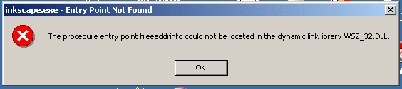
I brought down Inkscape-0.43+0.44pre0-1.win32.zip this afternoon. It unzipped OK but threw me the attached message when I tried to start it.
Any help appreciated.
cheers, Erik
Erik,
Are you using Win2k? The only pertinent-sounding articles I could find on the net mention this problem resulting from compiling on XP and running on Win2k.
I searched all through the code, especially the net-oriented stuff. The only place where I could find the freeaddrinfo() function invoked was in Loudmouth's (Jabber client used by Inkboard) lm-connection.c.
Which leads me to ask a question of the other guys who do win32: Wasn't Inkboard supposed to be disabled for this release?
bob
Erik Halbert wrote:
I brought down Inkscape-0.43+0.44pre0-1.win32.zip this afternoon. It unzipped OK but threw me the attached message when I tried to start it.
Any help appreciated.
cheers, Erik
Bob, Yes, I am using Win2k.
Erik.
----- Original Message ----- From: "Bob Jamison" <rwjj@...127...> To: "Erik Halbert" <kaver@...68...>; inkscape-devel@lists.sourceforge.net Sent: Monday, May 29, 2006 7:26 PM Subject: Re: [Inkscape-devel] win 32 crash on startup
Erik,
Are you using Win2k? The only pertinent-sounding articles I could find on the net mention this problem resulting from compiling on XP and running on Win2k.
I searched all through the code, especially the net-oriented stuff. The only place where I could find the freeaddrinfo() function invoked was in Loudmouth's (Jabber client used by Inkboard) lm-connection.c.
Which leads me to ask a question of the other guys who do win32: Wasn't Inkboard supposed to be disabled for this release?
bob
Erik Halbert wrote:
I brought down Inkscape-0.43+0.44pre0-1.win32.zip this afternoon. It unzipped OK but threw me the attached message when I tried to start it.
Any help appreciated.
cheers, Erik
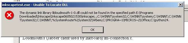
Bob, I noticed Inkview.exe next to Inkscape in the folder. It throws the same message.
Inkscape 0605211530 seems to work OK. That is the most recent version I can compare with. I renamed the Inkscape.exe file from Inkscape-0.43+0.44pre0-1.win32.zip as Inkscapetest.exe and dumped it into the 0605211530 folder and now it throws the attached message. Does this mean it may have something to do with loudmouth?
What to do about it?
Erik
----- Original Message ----- From: "Bob Jamison" <rwjj@...127...> To: "Erik Halbert" <kaver@...68...>; inkscape-devel@lists.sourceforge.net Sent: Monday, May 29, 2006 7:26 PM Subject: Re: [Inkscape-devel] win 32 crash on startup
Erik,
Are you using Win2k? The only pertinent-sounding articles I could find on the net mention this problem resulting from compiling on XP and running on Win2k.
I searched all through the code, especially the net-oriented stuff. The only place where I could find the freeaddrinfo() function invoked was in Loudmouth's (Jabber client used by Inkboard) lm-connection.c.
Which leads me to ask a question of the other guys who do win32: Wasn't Inkboard supposed to be disabled for this release?
bob
Erik Halbert wrote:
I brought down Inkscape-0.43+0.44pre0-1.win32.zip this afternoon. It unzipped OK but threw me the attached message when I tried to start it.
Any help appreciated.
cheers, Erik
All the advantages of Linux Managed Hosting--Without the Cost and Risk! Fully trained technicians. The highest number of Red Hat certifications in the hosting industry. Fanatical Support. Click to learn more http://sel.as-us.falkag.net/sel?cmd=lnk&kid=107521&bid=248729&da... _______________________________________________ Inkscape-devel mailing list Inkscape-devel@lists.sourceforge.net https://lists.sourceforge.net/lists/listinfo/inkscape-devel
On 5/29/06, Bob Jamison <rwjj@...127...> wrote:
Which leads me to ask a question of the other guys who do win32: Wasn't Inkboard supposed to be disabled for this release?
Yes it was. And this trouble was reported several times and is absolutely a mustfix. Hopefully the fix should be easy, just disable compiling the offending code altogether.

On 5/29/06, Bob Jamison <rwjj@...127...> wrote:
I searched all through the code, especially the net-oriented stuff. The only place where I could find the freeaddrinfo() function invoked was in Loudmouth's (Jabber client used by Inkboard) lm-connection.c.
Which leads me to ask a question of the other guys who do win32: Wasn't Inkboard supposed to be disabled for this release?
After ACSpike disabled Inkboard support, I did a "make clean" and sent the resulting binaries to a Win 2k user in the Jabber channel. The freeaddrinfo problem is now gone, but a we have a new error in its place, as documented in bug #1497132.
-William

bulia byak wrote:
On 5/26/06, David Christian Berg <david@...407...> wrote:
Cannot open file
The filename "test.pdf" indicates that this file is of type "PDF document". The contents of the file indicate that the file is of type "plain text document". If you open this file, the file might present a security risk to your system.
Apparently your operating system is unaware of the fact that there can be a valid PDF file without compression, i.e. as a plain ASCII text.
With or without compression a PDF file is always a binary file. A common trick to force (mail) systems realize this is to add a few non-ASCII characters in a comment at the beginning of the file. Never heard of viewers needing this.. But if it helps someone and harms no one I guess it is safe to add such a comment
Here's a simple patch (pick your favourite binary characters): ===== PdfObject *PdfFile::begin_document(double version) { Inkscape::SVGOStringStream os; + char bin[5]={'B'+128,'i'+128,'n'+128,'!'+128};
length = 0; pages = new PdfXref();;
os << "%PDF-" << version << "\n"; + os << "%" << bin << "\n";
obj_info = begin_object(); *obj_info << "<<\n";

On Jun 1, 2006, at 1:16 PM, Ulf Erikson wrote:
With or without compression a PDF file is always a binary file. A common trick to force (mail) systems realize this is to add a few non-ASCII characters in a comment at the beginning of the file. Never heard of viewers needing this.. But if it helps someone and harms no one I guess it is safe to add such a comment
Here's a simple patch (pick your favourite binary characters):
Committed.
Actually I changed my opinion on this. Seeing the fonts is nice, but instant apply and being able to move through the fonts with the down button which you can with a combobox is more convenient. I _always_ chose a font like that in any app where it is possible. Have a short text and go through the list of fonts with that text. That is because often you want the right font for that specific text. If you are not looking for a font but know what you want, the name is enough.
Just my 2 ¢
David
On Fri, 2006-05-26 at 17:47 +0200, David Christian Berg wrote:
On Fri, 2006-05-26 at 09:41 -0400, bulia byak wrote:
On 5/26/06, David Christian Berg <david@...407...> wrote:
E.g. while it's great to have the text editing finally in the top bar (THANK YOU SO MUCH!) the font selector should be a combobox and not some self-hacked thing
What's wrong with it? It currently has accessibility issues but they are fixable. Yet the usability advantage of the list with font samples is significant.
Hmm, true, I didn't think that wasn't possible to have the previews in a combobox. The point of my request, was that a combobox is a standard widget and hence is themable to look different from just a text entry and a button, which many themes do. But yes, the font sample is more important, I agree.
and the bold and italic buttons should be replaced with another drop down where one can choose from the available styles.
We decided against this because this list in the Font dialog is actually deceptive. We cannot set arbitrary styles because of CSS limitations. If you select e.g. some fancy "outline" or "swash caps" variant it will jump back to regular. There's a long-standing bug on that, and it's unfixable without adding a custom extension attribute or CSS property. So until this is done, it is much better to have only these primitive controls - they correspond 1:1 to CSS capabilities and therefore work reliably.
OK, another good point you got here. It's just very sad if you are doing professional (in the sense that you know what you do, not in the sense of selling your work) graphic editing. I'm already happy that it's planned to be changed as soon as that is easily possible.
Thanks for the answers!
Dvid
All the advantages of Linux Managed Hosting--Without the Cost and Risk! Fully trained technicians. The highest number of Red Hat certifications in the hosting industry. Fanatical Support. Click to learn more http://sel.as-us.falkag.net/sel?cmd=lnk&kid=107521&bid=248729&da... _______________________________________________ Inkscape-devel mailing list Inkscape-devel@lists.sourceforge.net https://lists.sourceforge.net/lists/listinfo/inkscape-devel
On 5/26/06, David Christian Berg <david@...407...> wrote:
Actually I changed my opinion on this. Seeing the fonts is nice, but instant apply
As instant as you press Enter. But we can make it instant-apply as well, optionally.
and being able to move through the fonts with the down button
Who said it's not possible with this widget? I bet it's easy, just needs to be enabled.
Besides you have type ahead find - type a letter and see a drop-down of fonts starting with that name (without previews, for speed).
which you can with a combobox is more convenient. I _always_ chose a font like that in any app where it is possible. Have a short text and go through the list of fonts with that text. That is because often you want the right font for that specific text. If you are not looking for a font but know what you want, the name is enough.
It is possible to make this widget to display the selected text if there is one, instead of the standard string.
Well, I think this widget should work like in OpenOffice, while I don't care if the fontname is displayed in font or separately or at all. Displaying the selected text should not be needed. Real instant apply is better for usability imho (no extra clutter) and also better to find the right font, because one can zoom into the parts one cares about.
David
On Fri, 2006-05-26 at 13:21 -0400, bulia byak wrote:
On 5/26/06, David Christian Berg <david@...407...> wrote:
Actually I changed my opinion on this. Seeing the fonts is nice, but instant apply
As instant as you press Enter. But we can make it instant-apply as well, optionally.
and being able to move through the fonts with the down button
Who said it's not possible with this widget? I bet it's easy, just needs to be enabled.
Besides you have type ahead find - type a letter and see a drop-down of fonts starting with that name (without previews, for speed).
which you can with a combobox is more convenient. I _always_ chose a font like that in any app where it is possible. Have a short text and go through the list of fonts with that text. That is because often you want the right font for that specific text. If you are not looking for a font but know what you want, the name is enough.
It is possible to make this widget to display the selected text if there is one, instead of the standard string.

On Fri, 26 May 2006, bulia byak wrote:
Date: Fri, 26 May 2006 09:41:49 -0400 From: bulia byak <buliabyak@...400...> To: David Christian Berg <david@...407...> Cc: ralf@...748..., inkscape-devel@lists.sourceforge.net, Milosz Derezynski <internalerror@...400...> Subject: Re: [Inkscape-devel] no dialogues, no icons
On 5/26/06, David Christian Berg <david@...407...> wrote:
E.g. while it's great to have the text editing finally in the top bar (THANK YOU SO MUCH!) the font selector should be a combobox and not some self-hacked thing
What's wrong with it? It currently has accessibility issues but they are fixable. Yet the usability advantage of the list with font samples is significant.
Haven't seen this new widget just yet but you might want to take a look at how Abiword (Gnome/GTK) previews fonts. The developers avoided showing the font name using the actual font because for many fonts (like Dingbats) it was unreadable and a preview at that size is not particularly useful. Instead abiword pops up a temporarly floating window (a bit like a giant tooltip) to preview the currently selected font at a decent size. Try it, you might like it, or get ideas from it.

Hi altogether!
On Fri, May 26, 2006 at 12:39:15AM +0200, David Christian Berg wrote:
Well, the dialogues work now and I also have the new UI by default. However, icons still don't work and keyboard shortcuts don't either :(
Maybe I should wait for a stable Inkscape build for Debian.
David
I think this is the problem I reported earlier. It seems that the datarootdir variable is not expanded correctly during configure. Could you please do a "grep root config.h" in your inkscape source dir after ./configure? Here I get | grep root config.h | #define INKSCAPE_DATADIR "${datarootdir}" | #define PACKAGE_LOCALE_DIR "${datarootdir}/locale"
but datarootdir should be expanded AFAIKS. My guess ist that we both use the version of autoconf ATM, but...
Thanks for any hints on this,
Wolfi
On Thu, 2006-05-25 at 16:01 -0500, Bob Jamison wrote:
David Christian Berg wrote:
Hey guys!
I just build inkscape from svn a few hours ago and no notice, that I don't have icons and dialogues. Any idea, what I'm doing wrong, or how to fix it?
Thanx!
David
David,
I'm almost certain that this is a result of some of your code being out of sync with Verbs. A "make clean" followed by a "make" should clean things up.
bob
All the advantages of Linux Managed Hosting--Without the Cost and Risk! Fully trained technicians. The highest number of Red Hat certifications in the hosting industry. Fanatical Support. Click to learn more http://sel.as-us.falkag.net/sel?cmd=lnk&kid=107521&bid=248729&da... _______________________________________________ Inkscape-devel mailing list Inkscape-devel@lists.sourceforge.net https://lists.sourceforge.net/lists/listinfo/inkscape-devel
I don't know, what I should get, but I get the same:
david@...151...:~/inkscape$ grep root config.h #define INKSCAPE_DATADIR "${datarootdir}" #define PACKAGE_LOCALE_DIR "${datarootdir}/locale"
David
On Sun, 2006-05-28 at 12:54 +0200, Wolfram Quester wrote:
Hi altogether!
On Fri, May 26, 2006 at 12:39:15AM +0200, David Christian Berg wrote:
Well, the dialogues work now and I also have the new UI by default. However, icons still don't work and keyboard shortcuts don't either :(
Maybe I should wait for a stable Inkscape build for Debian.
David
I think this is the problem I reported earlier. It seems that the datarootdir variable is not expanded correctly during configure. Could you please do a "grep root config.h" in your inkscape source dir after ./configure? Here I get | grep root config.h | #define INKSCAPE_DATADIR "${datarootdir}" | #define PACKAGE_LOCALE_DIR "${datarootdir}/locale"
but datarootdir should be expanded AFAIKS. My guess ist that we both use the version of autoconf ATM, but...
Thanks for any hints on this,
Wolfi
On Thu, 2006-05-25 at 16:01 -0500, Bob Jamison wrote:
David Christian Berg wrote:
Hey guys!
I just build inkscape from svn a few hours ago and no notice, that I don't have icons and dialogues. Any idea, what I'm doing wrong, or how to fix it?
Thanx!
David
David,
I'm almost certain that this is a result of some of your code being out of sync with Verbs. A "make clean" followed by a "make" should clean things up.
bob
All the advantages of Linux Managed Hosting--Without the Cost and Risk! Fully trained technicians. The highest number of Red Hat certifications in the hosting industry. Fanatical Support. Click to learn more http://sel.as-us.falkag.net/sel?cmd=lnk&kid=107521&bid=248729&da... _______________________________________________ Inkscape-devel mailing list Inkscape-devel@lists.sourceforge.net https://lists.sourceforge.net/lists/listinfo/inkscape-devel
On Mon, May 29, 2006 at 11:06:14AM +0200, David Christian Berg wrote:
I don't know, what I should get, but I get the same:
david@...151...:~/inkscape$ grep root config.h #define INKSCAPE_DATADIR "${datarootdir}" #define PACKAGE_LOCALE_DIR "${datarootdir}/locale"
I think you shouldn't get anything here, but I don't know much about this autoconf stuff, so I even don't know which of the auto-programms should expand this variable. I'll have to dig deeper into this I guess. It seems wierd to me that nobody else sees this. Perhaps the autotools in debian have abug here? Or are they newer than the ones people use normally anbd inkscape uses a deprecated feature?
This leads me to the question which distribution you tried to build inkscape on (unstable, testing, or sarge) and on which architecture?
Thanks,
Wolfi
Debian unstable, on a Pentium IV Mobile.
On Mon, 2006-05-29 at 15:48 +0200, Wolfram Quester wrote:
On Mon, May 29, 2006 at 11:06:14AM +0200, David Christian Berg wrote:
I don't know, what I should get, but I get the same:
david@...151...:~/inkscape$ grep root config.h #define INKSCAPE_DATADIR "${datarootdir}" #define PACKAGE_LOCALE_DIR "${datarootdir}/locale"
I think you shouldn't get anything here, but I don't know much about this autoconf stuff, so I even don't know which of the auto-programms should expand this variable. I'll have to dig deeper into this I guess. It seems wierd to me that nobody else sees this. Perhaps the autotools in debian have abug here? Or are they newer than the ones people use normally anbd inkscape uses a deprecated feature?
This leads me to the question which distribution you tried to build inkscape on (unstable, testing, or sarge) and on which architecture?
Thanks,
Wolfi

you are using windows and call from a different path?
Adib. --- David Christian Berg schrieb:
Hey guys!
I just build inkscape from svn a few hours ago and no notice, that I don't have icons and dialogues. Any idea, what I'm doing wrong, or how to fix it?
Thanx!
David
participants (12)
-
 Adib Taraben
 -
 Alan Horkan
 -
 Bob Jamison
 -
 Bryce Harrington
 -
 bulia byak
 -
 David Christian Berg
 -
 Erik Halbert
 -
 Jon A. Cruz
 -
 Ralf Stephan
 -
 Ulf Erikson
 -
 William Swanson
 -
 Wolfram Quester